Streamlining Boston's Local Transit Experience
MBTA - Charlie App
I’ll walk you through my personal design case study inspired by frustrations with Boston’s MBTA system and how I collaborated with a classmate and transformed those pain points into an intuitive transit experience. The goal was to create a solution that simplified fare management and provided real-time transit updates, making commuting a more seamless experience for all.
Project Type
Product Design
Role
UX/UI Design
Duration
8 Weeks
Process
Validating the problem
To understand the full commuting experience, we circulated a user survey amongst the daily commuters and gathered 55+ responses highlighting user frustrations and suggestions. We also interviewed 12 MBTA riders, mapped out their journeys, and analyzed competing transit apps.
Breaking Down the Project
The design process for the MBTA Charlie app began by validating the problem and understanding the user needs and frustration with the existing system. With these insights, we created personas and sketched user flows to ensure the app addressed key pain points. We iterated on wireframes and prototypes, focusing on reducing steps and improving information clarity.
Validating the problem
To understand the full commuting experience, we circulated a user survey amongst the daily commuters and gathered 55+ responses highlighting user frustrations and suggestions. We also interviewed 12 MBTA riders, mapped out their journeys, and analyzed competing transit apps.
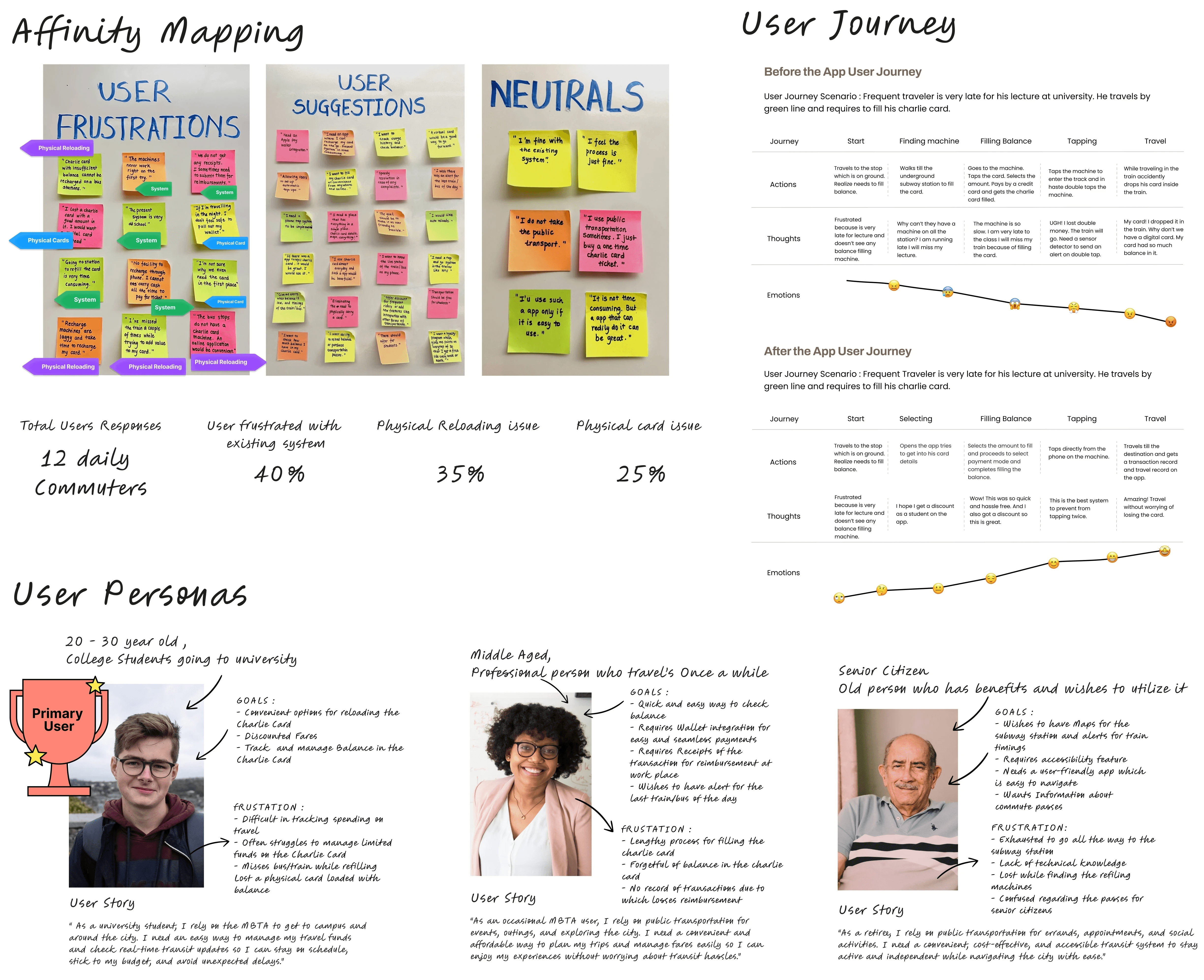
Problem
How might we enable commuters to conveniently track and reload their travel card funds in real-time, regardless of their location, to ensure a seamless transit experience across all modes of transport?
Boston’s transit system uses one travel card for subways, buses, and trams, however reloading is only possible at underground subway stations.This creates a major issue for bus and tram riders if their card runs out, they must detour to a subway station just to reload, leading to missed rides and delays. We identified three core issues: - No convenient option to reload funds. - Limited reloading machines only in subway stations. - No real-time balance tracking, making it easy to get caught off guard.

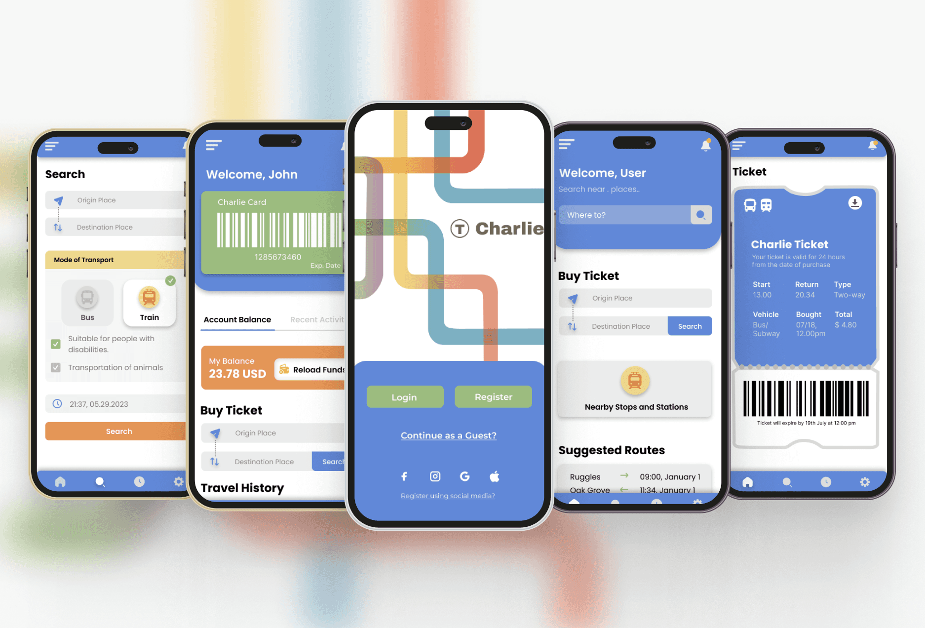
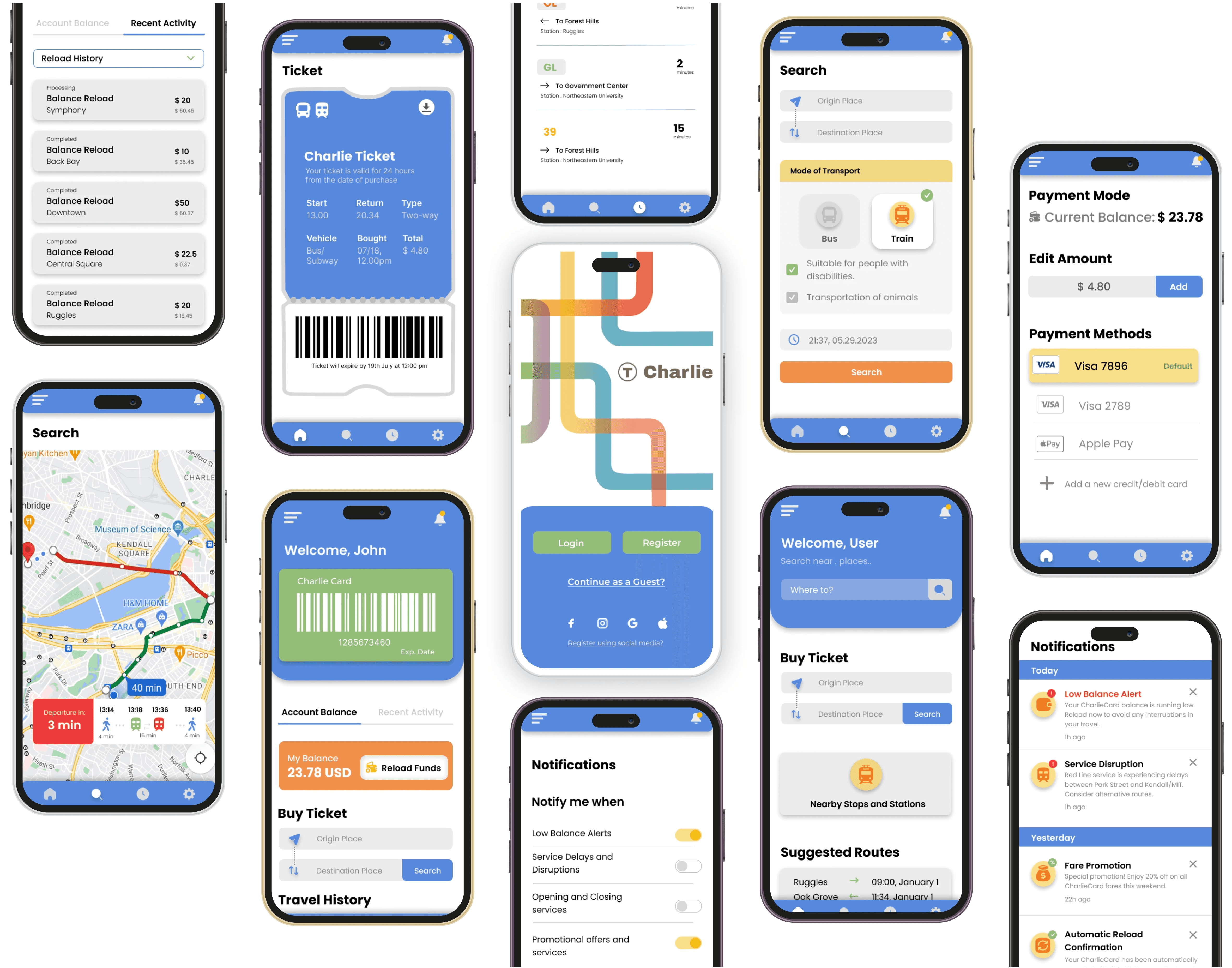
Solution
Easy reloading of funds
We designed an easy flow by having a CTA on the home page that takes the user to reload funds within the app, eliminating the need to visit stations for refilling, enhancing convenience.
Digital Cards and Tickets
15-20% users stressed about the fear of losing a full load card. We designed digital cards and tickets having barcode to scan, ensuring stress-free travel.
Real - Time Updates
The in-app notifications were designed to provide real time service disruptions, delays, and general updates, ensuring users stay informed about their travel plans and the app's latest developments.
Impact and Learnings
A Better MBTA Experience
We got a chance to present this project to the daily commuters at a college exhibition. User feedback was overwhelmingly positive, 80% of users reported faster, more convenient fare management. With this solution, commuters no longer have to plan detours to subway stations just to reload their card. Instead, they can focus on getting to their destination stress-free.
Reflecting the journey
This case study highlights how a real-world frustration can become a design opportunity. By focusing on user needs and thoughtful iteration, I was able to design a solution that improves the daily commute for MBTA riders.