Phillips
Flowers
Responsive UI Design
My Role
Web Designer
My Team
Kanksha Dixit
Timeline
April 2023 - June 2023
Tool Utilized
Figma, Adobe Photoshop, Canva, Word Doc, Draw.io
My Contributions
Brand Research, Information Architecture, Responsive Design
While researching website redesigns for my course, Phillip’s Flowers immediately stood out. Its deep emotional value, legacy of trust, and role in life’s most meaningful moments resonated with me. Yet, its digital presence felt disconnected from the magic it creates offline. This disconnect sparked my curiosity, and my goal became clear.
To design an experience that honors the brand’s tradition while meeting the expectations of today’s online shoppers.
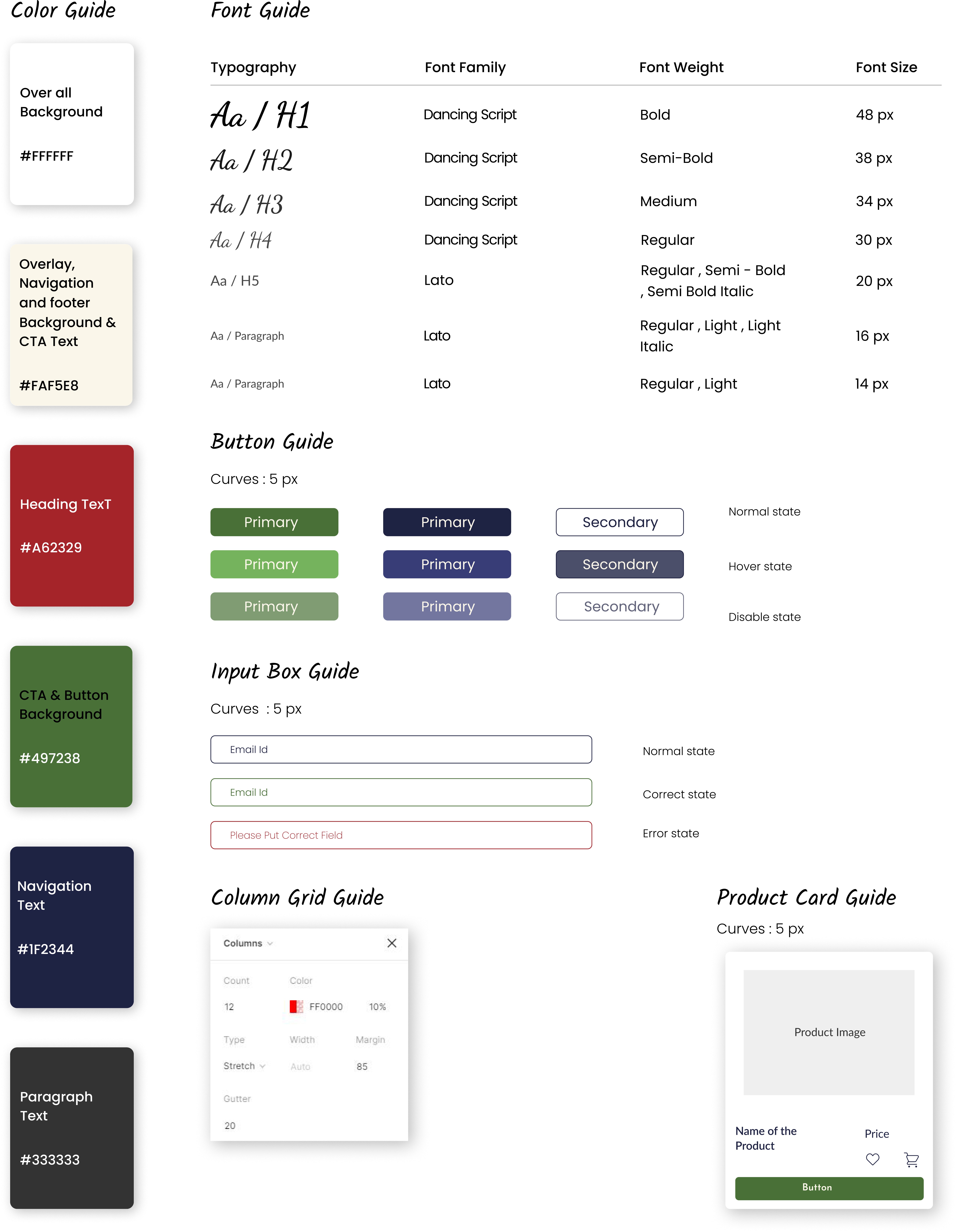
Style Guide
Information Architecture
Brand Discovery
Wireframes
UI Mockups
About the Brand
Phillips Flowers, a distinguished Chicago brand with a century of expertise, presents exquisite floral arrangements, plants, and gifts for diverse occasions. Boasting nine Illinois stores, they excel in tailored designs and prompt Chicago-local delivery. Specializing in thank you, birthday, sympathy, and get well flowers, they also cater to bulk wholesale orders, commercial plantscaping, and funeral tributes.
Target Audience
Through research analysis, I identified clear audience segments.
Primary Audience
Individuals aged 13–80+, frequently gifting flowers for occasions, seeking seamless online purchasing and delivery.
Secondary Audience
Event organizers (weddings, memorials, and corporates) looking for customized floral decor and office plantscaping.
Tertiary Audience
Bulk buyers and gardening hobbyists interested in flowers, gardening supplies, and related services.

UX Audit
While looking at the current website, I figured that it suffers from poor spacing and hierarchy. This was resulting in a cluttered layout. Below are the issues with their current website.
Lack of breathing space between content sections
Dense product grids and inconsistent typography
Outdated visual styling that weakens brand perception
Difficult-to-scan navigation
Poor alignment with the brand’s premium and emotional value
I reorganized the site map to group related pages, reduce clutter, and reflect how users actually browse. New sections like Careers and Events were added to support both user needs and business goals. This created a clearer, more intuitive structure that makes it easier for visitors to navigate, explore, and take action.
A full redesign focused on clarity, breathing space, emotional connection, and responsive structure would significantly enhance both usability and conversion
Establish a clear visual hierarchy using consistent spacing and typography
Streamline navigation for easier discovery of key products and services
Apply a modern, elegant visual style that reflects the brand’s legacy and trust
Organize product listings with intuitive filters and stronger call-to-actions
Replace cluttered, repetitive content with focused, story-driven messaging
A consistent style guide with a premium feel and trust-building elements like reviews and testimonials.
Page
Changes
Strategically designed with an eye-catching hero banner, prominent CTAs, minimal text, and rich product visuals to guide customers smoothly.
Shop Page
Emphasized easy filtering, intuitive sorting, and interactive product cards to encourage quick purchasing decisions.
Individual Product Page
Included recommended products to improve cross-selling.
Events Page
User-friendly toggle between weddings and other events to target appropriate user segments.
Careers Page
Clearly structured job postings and highlighted company culture to attract potential candidates.
Contact Page
Unified local store locations, tracking, and inquiries into one accessible page.
